Select Any Component.
Get Clean Code.
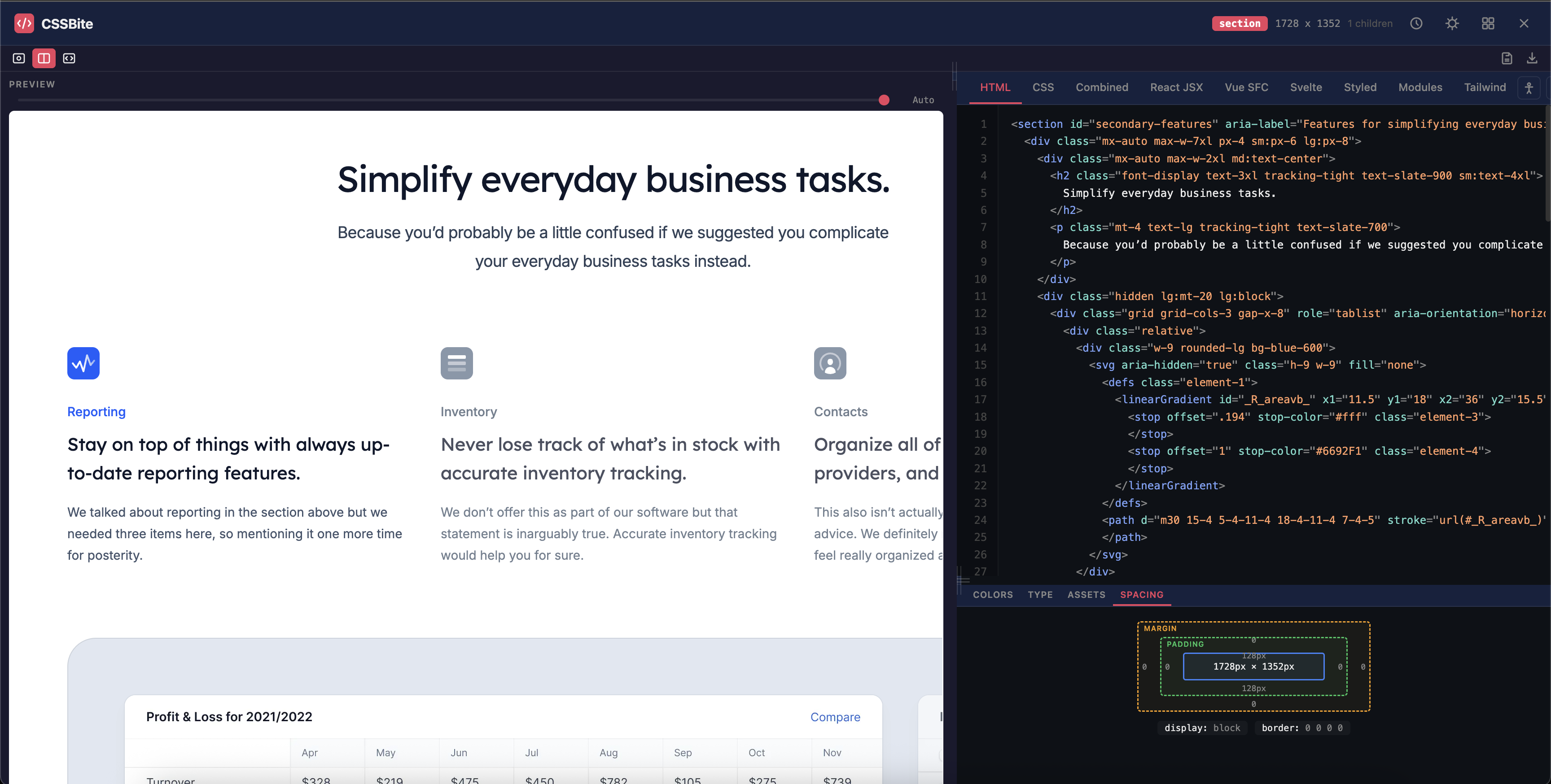
CSSBite auto-detects sections, cards, and components on any website. One click extracts production-ready HTML, CSS, React, Vue, Svelte, Tailwind, and more.
Everything you need
Built for developers who want pixel-perfect code extraction
Smart Component Detection
Auto-snaps to sections, cards, navs, and heroes. No more accidentally selecting tiny spans or entire pages.
9 Export Formats
HTML, CSS, React JSX, Vue SFC, Svelte, Styled Components, CSS Modules, and Tailwind CSS — all from one extraction.
Live Design Inspector
Extract colors, typography, assets, and spacing tokens. See every design detail as you hover.
Measure Mode
Hold Alt to measure pixel-perfect distances between any two elements, just like Figma.
Copy Styles on Hover
Press C while hovering to instantly copy any element's computed CSS to your clipboard.
Pixel-Perfect Preview
See exactly how your extracted component renders with the original website's fonts and background.
Component Library
Save, organize, and export/import your grabbed components. Build your personal collection.
CodePen Export
One-click export to CodePen with full visual parity. Share or iterate instantly.
Accessibility Audit
Check for missing alt text, heading hierarchy, color contrast, and ARIA issues in one click.
How it works
Activate
Click the CSSBite icon or press Ctrl+Shift+G
Hover & Select
Smart detection highlights meaningful components as you move
Extract
One click captures clean HTML, CSS, and framework code
Use Anywhere
Copy, download, save to library, or export to CodePen
One component, every framework
Extract code in the format your project needs
<div class="card">
  <img class="card-image" src="photo.jpg" alt="Feature" />
  <div class="card-body">
    <h3 class="card-title">Component Title</h3>
    <p class="card-text">
      A short description of this component
      extracted directly from the live website.
    </p>
    <a href="#" class="card-btn">Learn More</a>
  </div>
</div>
.card {
background: #1a1a2e;
border-radius: 12px;
overflow: hidden;
box-shadow: 0 4px 24px rgba(0, 0, 0, 0.3);
max-width: 360px;
}
.card-image {
width: 100%;
height: 200px;
object-fit: cover;
}
.card-body { padding: 1.5rem; }
.card-title {
font-size: 1.25rem;
font-weight: 600;
color: #eeeeee;
}
.card-btn {
display: inline-block;
padding: 0.5rem 1.25rem;
background: #e94560;
color: #fff;
border-radius: 6px;
}import React from "react";
import "./Card.css";
export default function Card() {
return (
<div className="card">
<img className="card-image" src="photo.jpg" alt="Feature" />
<div className="card-body">
<h3 className="card-title">Component Title</h3>
<p className="card-text">Description here</p>
<a href="#" className="card-btn">Learn More</a>
</div>
</div>
);
}<template>
<div class="card">
<img class="card-image" src="photo.jpg" alt="Feature" />
<div class="card-body">
<h3 class="card-title">Component Title</h3>
<p class="card-text">Description here</p>
<a href="#" class="card-btn">Learn More</a>
</div>
</div>
</template>
<script setup>
// No reactive state needed
</script>
<style scoped>
.card { background: #1a1a2e; border-radius: 12px; }
</style><div class="card">
<img class="card-image" src="photo.jpg" alt="Feature" />
<div class="card-body">
<h3 class="card-title">Component Title</h3>
<p class="card-text">Description here</p>
<a href="#" class="card-btn">Learn More</a>
</div>
</div>
<style>
.card { background: #1a1a2e; border-radius: 12px; }
.card-title { font-size: 1.25rem; font-weight: 600; }
</style>import styled from "styled-components";
const CardWrapper = styled.div`
background: #1a1a2e;
border-radius: 12px;
overflow: hidden;
`;
const CardImage = styled.img`
width: 100%; height: 200px; object-fit: cover;
`;
const CardTitle = styled.h3`
font-size: 1.25rem; font-weight: 600; color: #eee;
`;
export default function Card() {
return (
<CardWrapper>
<CardImage src="photo.jpg" alt="Feature" />
<CardTitle>Component Title</CardTitle>
</CardWrapper>
);
}// Card.module.css
.card { background: #1a1a2e; border-radius: 12px; }
.cardImage { width: 100%; height: 200px; object-fit: cover; }
.cardBody { padding: 1.5rem; }
.cardTitle { font-size: 1.25rem; font-weight: 600; }
.cardBtn { background: #e94560; color: #fff; border-radius: 6px; }
// Card.jsx
import styles from "./Card.module.css";
export default function Card() {
return (
<div className={styles.card}>
<img className={styles.cardImage} src="photo.jpg" />
<div className={styles.cardBody}>
<h3 className={styles.cardTitle}>Title</h3>
<a className={styles.cardBtn}>Learn More</a>
</div>
</div>
);
}<div class="max-w-sm rounded-xl overflow-hidden shadow-lg bg-gray-900">
<img class="w-full h-48 object-cover" src="photo.jpg" alt="Feature" />
<div class="p-6">
<h3 class="text-xl font-semibold text-gray-100 mb-2">
Component Title
</h3>
<p class="text-gray-400 leading-relaxed mb-4">
A short description extracted from the live website.
</p>
<a href="#" class="inline-block px-5 py-2 bg-rose-600 text-white
rounded-md font-medium hover:bg-rose-700 transition">
Learn More
</a>
</div>
</div>Power user shortcuts
Navigate, select, and extract without touching your mouse
Your data stays with you
CSSBite Pro
Everything in Free, plus 14 advanced features
- Animation & transition extraction
- ::before / ::after pseudo-elements
- Hover, focus & active states
- SCSS & LESS output formats
- Design token export (CSS vars, JSON, Tailwind)
- AI-powered class renaming
- AI code cleanup
- Auto-responsive media queries
- Performance audit
- Full page capture & screenshot
- Project generator (Next.js, React, Vue, Svelte)
- Multi-tab extraction
- Style guide builder
- Export to GitHub Gist & VS Code
Animation Extraction
Captures @keyframes and CSS transitions automatically.
Pseudo-element Support
Extracts ::before and ::after styles with content and positioning.
Hover & Focus States
Captures :hover, :focus, and :active CSS from stylesheets.
SCSS & LESS Output
Nested syntax with auto-extracted variables.
Design Token Export
CSS variables, JSON, Tailwind config, or SCSS variables.
AI Class Renaming
Turns obfuscated names into readable semantic classes.
AI Code Cleanup
Semantic HTML, sorted CSS, removed redundant wrappers.
Auto Responsive
Generates media queries for tablet and mobile automatically.
Performance Audit
Flags expensive CSS and suggests optimizations.
Full Page Capture
Screenshot the entire page with scroll-and-stitch.
Project Generator
Generate a Next.js, React, Vue, or Svelte project as ZIP.
Multi-Tab Extraction
Keep multiple extractions open and switch between them.
Style Guide Builder
Generate a style guide from your component library.
Export to GitHub & VS Code
Send code to GitHub Gist or open directly in VS Code.
Start grabbing code today
Free forever for individual developers. Pro features coming soon.